Table of Contents
Relative Rotation Graph (RRG) Charts
Relative Rotation Graphs (“RRG charts”) show you a security's relative strength and momentum relative to a collection of other securities. RRG charts were developed by Julius de Kempenaer and have been available on Bloomberg terminals since 2011.
Check out our Relative Rotation Graphs overview video below, or just read on to learn how to get the most out of RRG charts.
Note: Both “Relative Rotation Graph™” and “RRG™” are registered trademarks of RRG Research.
RRG charts differ from most other financial charts in that the horizontal axis does not represent time. An RRG chart is a scatter plot, with de Kempenaer's Relative Strength Ratio indicator as the horizontal axis and his Relative Strength Momentum indicator as the vertical axis.
Here's an example of an RRG chart:
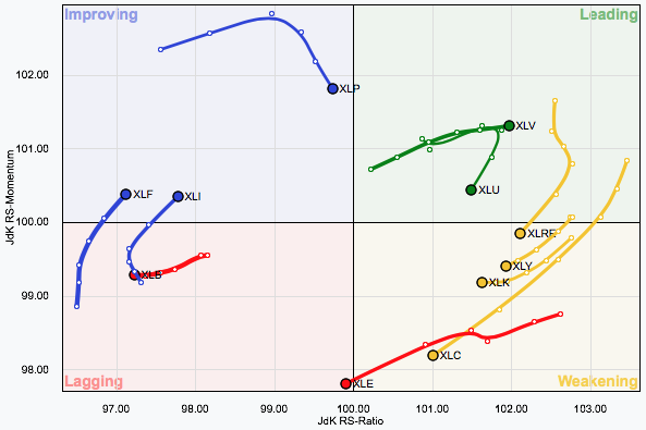
Note that each symbol on an RRG chart is plotted as a dot with a “tail” extending backward. The tail shows you the history of the symbol's position in the past. You can use a slider to control the length of the tail.
Each dot on each symbol's tail represents one period - anywhere from 1 month to 5 minutes, depending on the “Period” setting. The large dot at the end of the tail represents the current RRG values for that ticker symbol. Those values are updated continually throughout the current trading week; however, new dots are only added at the start of a new week.
There are four quadrants on the RRG chart:
- Leading (Green) - strong relative strength and strong momentum
- Weakening (Yellow) - strong relative strength but weakening momentum
- Lagging (Red) - weak relative strength and weak momentum
- Improving (Blue) - weak relative strength but improving momentum
As you can see in the example above, stocks typically progress through the quadrants in a clockwise manner. The color of each line is determined by the color of the quadrant where the line ends. The width of each stock's line is determined by the ending dot's distance from the center of the plot.
For more on interpreting RRG charts, please see our ChartSchool article on the topic. You can also read more about RRG charts in Julius de Kempenaer's blog.
Free vs. Members-Only RRG Features
Free users are only able to see a single, fixed RRG chart that consists of the major North American market averages with 1 year of data. Free users can change the chart's ending date, scaling and trail length, but they are not able to add/remove ticker symbols, view longer range data or resize the chart.
Members can also create RRG charts from their ChartLists. However, these charts are limited to the first 50 ticker symbols on the ChartList.
Creating RRG Charts
There are multiple ways to create an RRG chart, including:
- Clicking on “Charts & Tools” at the top of any page, then clicking on the “Launch RRG Chart” link in the Relative Rotation Graphs section.
- Clicking on the “RRG Charts” link in the “Member Tools” area of Your Dashboard.
Members can use the text box at the top of the RRG tool to change the list of symbols used in the chart. Alternately, they can select from one of several predefined symbol groups using the “Groups” dropdown. Up to 50 different ticker symbols can be charted on an RRG chart.
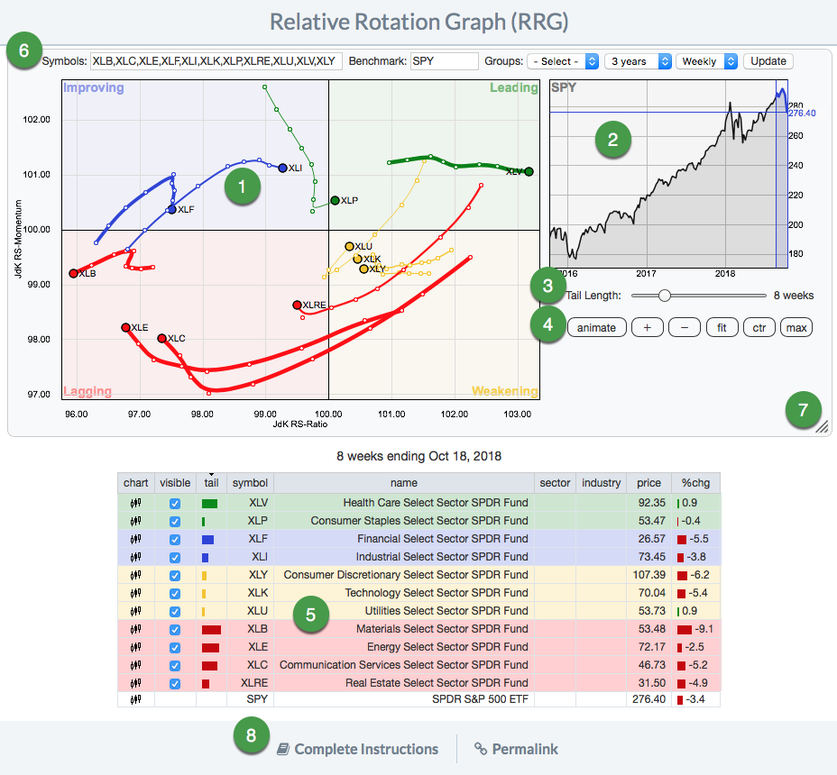
Members can also change the RRG chart's “Benchmark” symbol, that being the symbol (typically an index like $SPX) that is used in the relative performance calculations. A line chart of the benchmark symbol is always displayed to the right of the RRG chart.
Elements of the RRG Chart Tool
The RRG Chart Tool has several different elements:
- The RRG Plot
- The “Benchmark” Chart (typically the S&P 500)
- The “Tail Length” Slider
- The Scaling Control Buttons
- The Symbols Table
- The Chart Configuration Buttons: Symbols, Benchmark, Groups, Range, Period, and the Update Button (members-only)
- The Resize icon (members-only)
- Additional Resources
Modifying an RRG Chart
Changing the Chart's Ending Date
Next to the RRG chart is a smaller chart of the benchmark symbol (typically $SPX, the S&P 500 Large Cap Index). You can click anywhere on that graph to change the ending date for the RRG plot. The benchmark chart is meant to give you a sense of what the market as a whole was doing at the time of the RRG plot. In addition to clicking on the benchmark chart, you can also click and drag to manually create a chart animation.
Another way to change the ending date is to simply use the left and right arrow keys on your keyboard.
You can also press the “animate” button below the benchmark chart to automatically move the RRG plot through all the available data.
Changing the Tail Length
You can use the “Tail Length” slider below the benchmark chart to adjust the length of the tails on the RRG plot. The zone highlighted in blue on the benchmark chart shows the period of time covered by the tails.
Highlighting Individual RRG Lines
You can click on any of the lines in the Symbol Table below the RRG Plot to turn on highlighting for that symbol. Click on the line again to turn off highlighting. Only one line at a time can be highlighted.
Changing the Graph's Scaling
You can use the buttons below the benchmark chart to adjust the RRG plot's scaling.
- + and – allow you to manually zoom the RRG plot in and out.
- fit automatically adjusts the vertical scales so that all RRG lines are always visible.
- ctr enables a mode that ensures that all RRG lines are always visible and also centers the origin of the chart (very useful with the animate option).
- max expands the vertical scales to the maximum size needed to see every RRG line at any point in time.
In addition to those buttons, you can also click on the RRG plot itself and drag to change the position of the chart's origin.
Chart Configuration (Members Only)
Changing the Symbols or Benchmark
Members can change the symbols included in the RRG chart by editing the list in the Symbols box above the chart and clicking the “Update” button.
Members can also change the benchmark symbol that the other symbols are compared against. This is done by editing the symbol in the Benchmark box above the chart and clicking the “Update” button.
Additionally, members can use the Groups dropdown above the chart to create an RRG chart from a number of different predefined groups.
Changing the Range
Members can use the “Range” dropdown above the chart to create shorter- or longer-term RRG charts. The choices available range from 1 day to 10 years. Longer duration charts take longer to load.
Note: A ticker symbol must have at least 50 data points in order to appear on an RRG chart.
Changing the Chart's Period
By default, RRG charts use weekly data in their calculations. Members can change the chart so that it uses daily data using the “Periods” dropdown above the chart.
For more details on comparing and interpreting weekly vs. daily RRG charts, see our ChartSchool article on RRG Charts.
Resizing an RRG Chart
Members can click and drag the resize icon in the lower right corner of the RRG chart to change the size of the chart. In addition, you can click the “Maximize” icon in the upper right corner of the chart to expand it to occupy the entire browser window.
Saving an RRG Chart
Members can click the “Permalink” link located below the symbol table to get a link to their chart, which can then be bookmarked and/or used in web links.
Viewing ChartLists in RRG Format
Members can also use RRG charts to view ChartLists. From Your Dashboard, you can select “RRG” from the “View As” dropdown next to the ChartList you wish to view. Alternately, you can switch to RRG format from other ChartList formats, such as Summary, GalleryView or CandleGlance. To do so, select “RRG” from the “View List As” dropdown.
The RRG View will display up to 50 symbols from your ChartList in RRG format. Above the chart, you can use the “Select List” dropdown to choose a different ChartList to display.
You can add or edit notes for the entire ChartList by clicking in the ChartList Notes box at the bottom of the screen. Click the “Save” button once you've made your changes. For more editing functionality, use the “Edit List” button at the top of the screen to load the ChartList in Edit View.
The “Delete List” and “New List” buttons can be used to delete the current ChartList and create a new ChartList, respectively.
Frequently Asked Questions
Q: When are RRG charts updated?
A: RRG charts are updated in real-time. On weekly charts, they are also updated and finalized on the week's close, typically on Friday.
Q: How much data is needed to chart on the RRG?
A: There needs to be a minimum of 50 data points. This amounts to roughly 10 weeks of data for a daily RRG, one year of data for a weekly RRG, and just over four years of data for a monthly RRG.
Q: What does the percent change on the chart represent?
A: The percent change is the change since the beginning of the tail. If the tail length is set to 1, it is the change over one period (so the daily change on a daily RRG chart, for example). If the tail length is set to 10, it is the performance over that period (10 days, ten weeks, 10 hours, etc., depending on the period shown).