Table of Contents
GoNoGo Charts Plug-In
Welcome to the GoNoGo Charts plug-ins for StockChartsACP. The GoNoGo Starter Pack is a free plug-in that introduces StockCharts members to GoNoGo Charts with a custom GoNoGo chart type and an accompanying ChartStyle. The full GoNoGo Charts plug-in includes a more in-depth custom chart type, along with two indicators and an accompanying ChartStyle.
These tools, developed by GoNoGo Charts, use a combination of technical analysis and statistical measures to help investors understand the direction and continuity of price trends for any security and any asset class, across any timeframe.
Check out our GoNoGo Charts overview video below, or just read on to learn how to get the most out of these plug-ins.
Install the GoNoGo Starter Pack Plug-In | Buy the GoNoGo Charts Plug-In
GoNoGo Trend
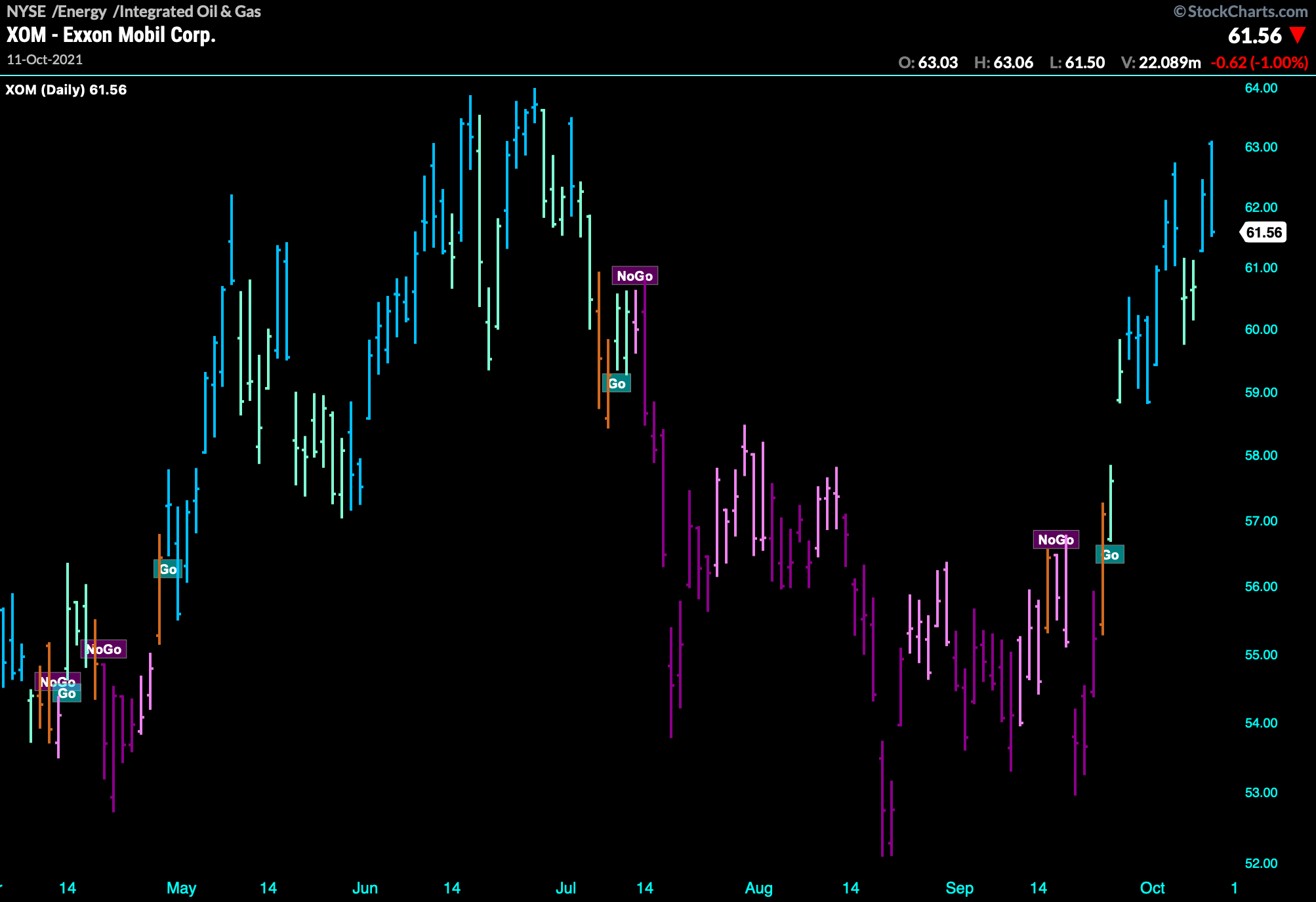
The GoNoGo Trend chart type colors the price action of any security according to the strength of its trend, making it simple to identify and interpret the current trend:
- Bright Blue price bars indicate the strongest bullish environment.
- Aqua bars are slightly less bullish; they often occur at the start of a new trend, or as a strong bullish trend begins to weaken.
- Amber bars represent uncertainty, often appearing in the transition from bull trend to bear trend and vice versa.
- Pink bars indicate a lower intensity bearish environment
- Dark Purple bars are shown when the bearish trend intensifies.
The “Go” and “NoGo” labels on the chart mark transitions to bull or bear trends, respectively.
The GoNoGo Trend chart type is included with both the GoNoGo Starter Pack and the full GoNoGo Charts plug-in. To use the GoNoGo Trend chart type, simply select GoNoGo Trend (or GoNoGo Trend Pro for full plug-in users) from the dropdown menu of chart types at the top of ACP.
Once this chart type is selected, you can adjust the settings by clicking the gear icon in the Chart Settings panel on the left. Choose between candlesticks or OHLC bars, and set the style of the price bars.
Note: The GoNoGo Trend Pro chart type included with the full plug-in also displays GoNoGo Icons.
You can learn more about the GoNoGo Trend from the following videos.
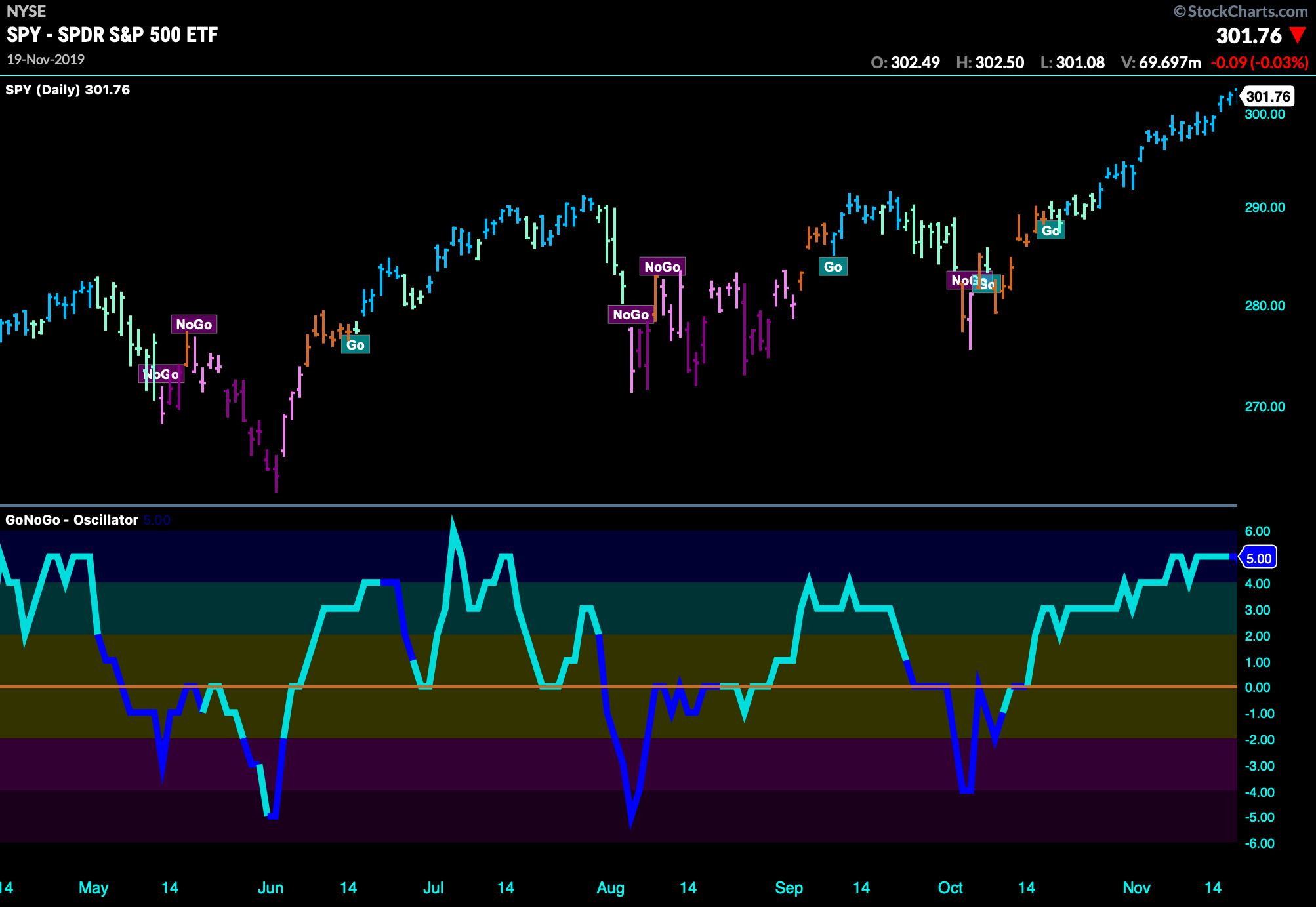
GoNoGo Oscillator
Momentum goes hand in hand with trend identification. The GoNoGo Oscillator helps investors understand the velocity of price change, giving valuable information about the strength of a trend and the market’s conviction in it. Strong or increasing momentum provides confirmation of a trend, while decelerating momentum gives the investor a leading indication of weakness and the potential for reversal.
The GoNoGo Oscillator blends several popular momentum ideas together to provide the user with meaningful momentum analysis. As an oscillator, the indicator’s values range above and below zero, from -6 to +6, with extreme positive values being considered overbought and extreme negative values, oversold. The background color denotes the range of values from most oversold (dark purple) to most overbought (dark blue). Within a trend, a security’s momentum may reach overbought/oversold levels, then fall back toward the zero-line, and then rally again. A break above/below zero would indicate divergent momentum – unsustainable for a healthy trend.
In addition, the GoNoGo Oscillator’s color features a change from light blue to dark blue when volume is heavier than normal. Confirming or diverging volume readings give investors additional insight at pivotal decision points.
Users of the full GoNoGo Charts plug-in can add the GoNoGo Oscillator indicator from the Chart Settings panel on the left. This indicator is not available in the GoNoGo Starter Pack.
Explore the GoNoGo Oscillator in the video below.
GoNoGo Icons
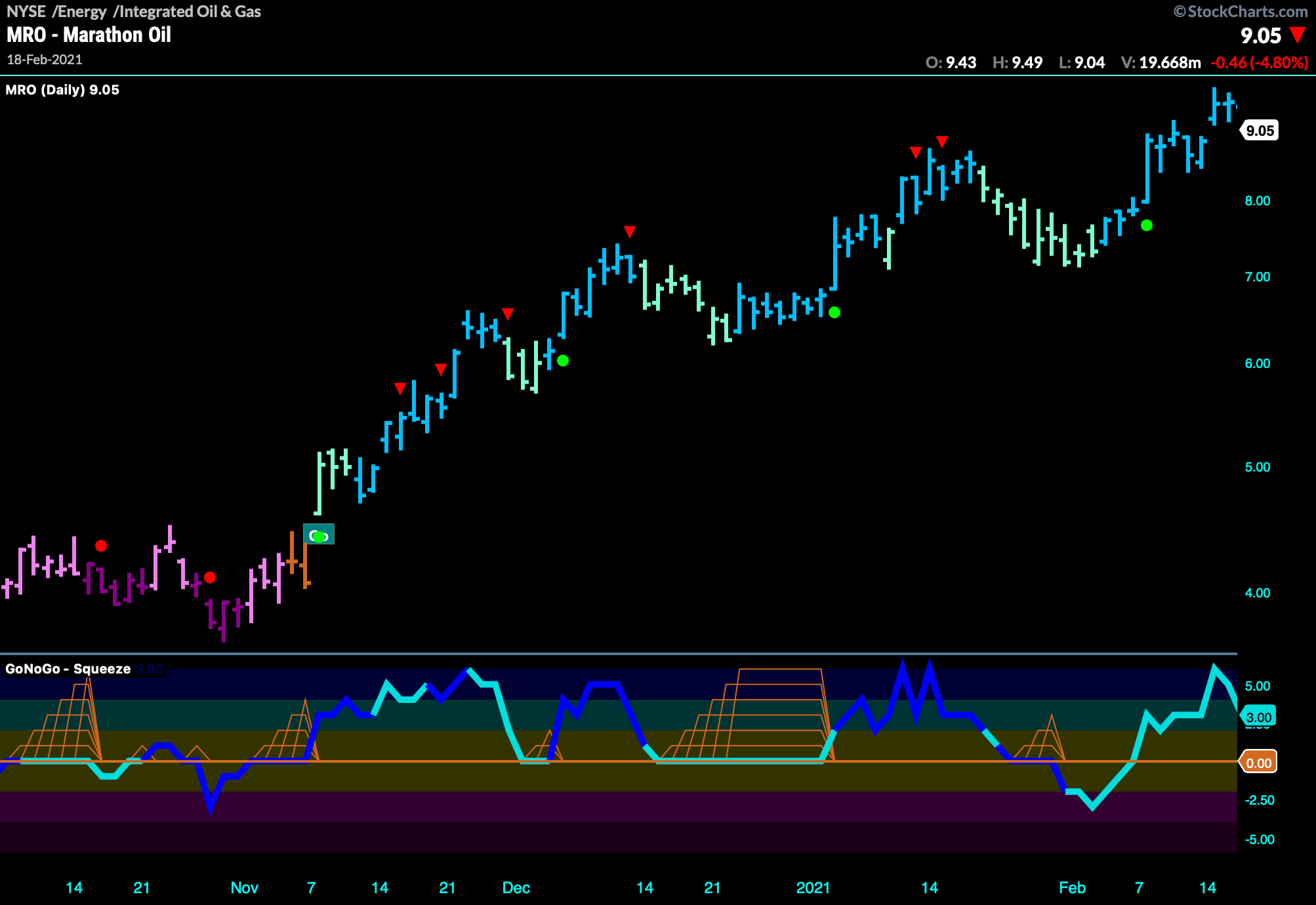
GoNoGo Charts highlight low risk opportunities for trend participation and alert investors to short- term countertrend corrections with intuitive icons directly in the price action.
The resurgence of momentum in the direction of the trend is an excellent entry opportunity, or the chance to scale up positions. GoNoGo Icons illuminate these events on the chart with green or red solid circles. When GoNoGo Trend is painting blue bars, a green solid circle will appear above price each time GoNoGo Oscillator finds support at zero. When GoNoGo Trend is painting purple bars, a red solid circle will appear each time GoNoGo Oscillator hits resistance at the zero-line from below.
Contrarily, within a “Go” trend, a security’s momentum may reach overbought levels, then fall back toward the zero-line. While in a “NoGo” trend, a security’s momentum may fall to extreme oversold levels, and then cool. As the momentum calculations retreat from extreme overbought or oversold levels, GoNoGo Icons highlight the possible countertrend correction in price. These potential short-term corrections are denoted with solid green arrows in an uptrend and solid red arrows in a downtrend.
![]()
To use the GoNoGo Icons, full plug-in users can simply select GoNoGo Trend Pro from the dropdown menu of chart types at the top of ACP. This chart type includes both the GoNoGo Trend colored price bars and labels, but also the colored circles and arrows of the GoNoGo Icons tool.
Once this chart type is selected, you can adjust the settings by clicking the gear icon in the Chart Settings panel on the left. Choose between candlesticks or OHLC bars, and set the style of the price bars and icons.
Note: The GoNoGo Trend Pro chart type, which includes the GoNoGo Icons, is only available to users with the full GoNoGo Charts plug-in. This chart type is not available in the GoNoGo Starter Pack.
GoNoGo Squeeze
Studies have shown that momentum readings are not only useful for mean-reversion strategies but can also add insight within trend. The GoNoGo Oscillator is calculated so that when inputs are in neutral territory, it rests at zero. Meaning, when enthusiasm wanes within a trending market, the GoNoGo Oscillator provides an objective point of support/resistance for momentum at the zero line.
Where there is no excessive buying or selling, price action stagnates, volatility declines, markets move sideways, and GoNoGo Oscillator rests at the zero line. This volatility compression is highlighted by GoNoGo Squeeze. A visual grid in the oscillator panel climbs as momentum remains neutral reaching extremes with prolonged reduction in volatility. Like a coiled spring, researchers have shown that following these stalemates between buyers and sellers, a breakout can be expected.
Users of the full GoNoGo Charts plug-in can add the GoNoGo Squeeze indicator from the Chart Settings panel on the left. This indicator is not available in the GoNoGo Starter Pack.
GoNoGo ChartStyles
GoNoGo chart types and indicators are best used on charts with a dark color scheme and no grid lines. To simplify your chart configuration, each GoNoGo plug-in comes with a ChartStyle for quickly creating GoNoGo charts.
The “GoNoGo - Basic” ChartStyle included with the GoNoGo Starter Pack creates a simple GoNoGo Trend chart. The “GoNoGo - Complete” ChartStyle included with the full GoNoGo Charts plug-in creates a more complex GoNoGo Trend chart with GoNoGo Icons overlaid and a separate GoNoGo Squeeze indicator panel.
Once the plug-in is installed, the relevant GoNoGo ChartStyle can be accessed in the Sample Styles section of the ChartStyles panel.