This is an old revision of the document!
Table of Contents
Dynamic Yield Curve
The Dynamic Yield Curve tool shows the relationship between multiple interest rates and stocks over time.
The term “yield curve” refers to a line that connects the different yield values for several interest rates of different duration. Under normal conditions, as the bond duration increases (the x-axis), the interest rate for that bond should also increase (y-axis), leading to a yield curve that moves higher as you go from left to right on the chart.
Under certain economic conditions, the yield curve can become flat or even inverted, warning investors to be cautious. Our Dynamic Yield Curve tool allows you to observe the current curve at a glance, explore historical curves and analyze how yield curves behave under differing market conditions. For more information on interpreting the yield curve, please see our |Yield Curve article in ChartSchool.
Check out our Dynamic Yield Curve overview video below, or just read on to learn how to get the most out of our Dynamic Yield Curve tool.
Accessing the Dynamic Yield Curve Page
You can find a link to the Dynamic Yield Curve tool in the “Charting Tools” section of the Charts & Tools page, as well as in the “Member Tools” area of Your Dashboard (or just click here).
Parts of the Dynamic Yield Curve Tool
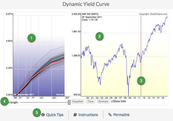
- The Interest rates pane
- The S&P 500 price plot
- The Date Slider
- The Yield Curve Controls
- Additional Resources
Yield Curve Controls
- Date Slider - The red vertical line on the S&P 500 chart, which you can use to view different time periods. Click and slide the line over the years you want to examine, or click on the location where you want the line to jump. The corresponding yield curve for that time period will show up in the blue chart on the left. The curved red line is the yield curve for the selected date on the S&P 500 chart. The fading “trails” behind the red line show you where the yield curve was in the previous days.
- Trail Length - Controls the number of additional yield curves displayed. The additional curves are displayed in black and “fade” into the chart as they get older.
- Snapshot - “Locks” the yield curve's display for the current date. The locked curve is displayed in dark red. You can compare the locked curve to the curve from a different date by moving the date slider.
- Clear - Removes the current snapshot.
- Animate - Animates the date slider, allowing you to watch changes in the yield curve over time.
- Show Info - When checked, this option displays specific chart values as you move your mouse over the chart.