This is an old revision of the document!
Table of Contents
Charting Market Breadth Indicators
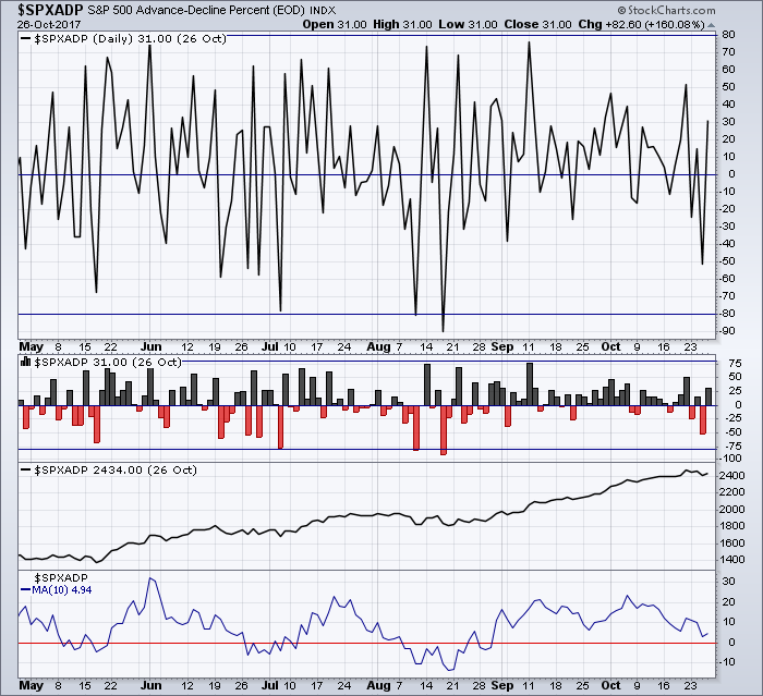
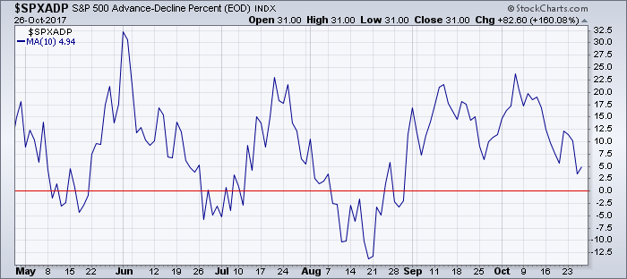
Market breadth data charts often look very erratic and “noisy” since the data is usually a count or percentage of stocks rather than a price. This means that the values can fluctuate dramatically from day to day. Some breadth indicators even fluctuate between positive and negative values on a regular basis.
The chart above shows S&P 500 net advances expressed as a percentage ($SPXADP). It oscillates above and below the zero line, within the range of +100% to -100%.
You can see from the chart that the values change wildly from day to day, making for a very erratic chart. Using the horizontal lines we've added to the chart, we can still spot the big moves that exceed +80% or -80%, but it is difficult to determine what is happening in between these levels.
Fortunately, StockCharts offers three different chart types that are especially valuable for reducing the “noise” on market breadth charts and making it easier to read and interpret them: Histogram, Cumulative, and Invisible chart types. Each of these chart types will be discussed below.
Histogram Chart Type
With a histogram chart, each period is represented as a bar that extends from zero to the period's closing value. For regular stocks, where the value is always positive, the histogram chart doesn't look that different from an area chart. For breadth indicators where the daily values can be negative, a histogram chart is very useful.
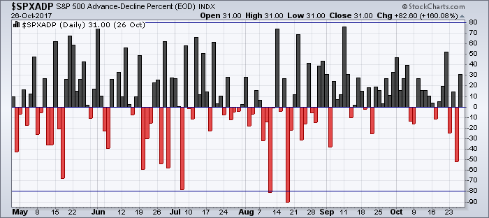
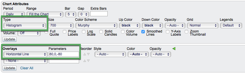
The chart above shows the same indicator ($SPXADP), but charted as a histogram. To do this, simply change the Type dropdown in the Chart Attributes section to “Histogram” and click Update.
The histogram chart is plotting the same data as the line chart, but the histogram format makes it much easier to see clusters of up days or down days. The horizontal lines make it easy to spot overbought and oversold levels. Our chart is already easier to interpret.
Histogram charts are useful for any kind of indicator that oscillates around the zero line. Net advances, net advancing volume and net new highs are classic examples.
Cumulative Chart Type
A cumulative chart creates a running total of the periodic values for an indicator. Basically, this indicator adds the periodic value when positive and subtracts the periodic value when negative. Just like Histogram charts, Cumulative charts are best suited for indicators where the daily values fluctuate between positive and negative values.
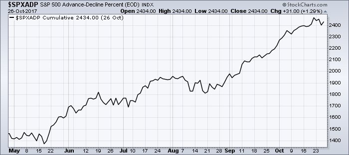
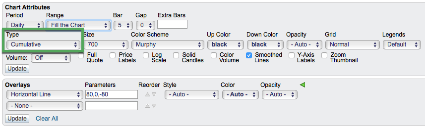
The chart above shows $SPXADP again, but charted as a cumulative indicator. To do this, simply change the Type dropdown in the Chart Attributes section to “Cumulative” and click Update. Note: if you have any horizontal lines on your chart from the previous example, you will want to remove them for this chart.
This type of chart smooths out the day-to-day volatility of the raw data, and allows the chartist to more easily see trends in the market breadth values over time.
Note: the absolute values for an indicator plotted in cumulative mode are irrelevant, changing based on where the calculation is started for each chart. Users should disregard the scale on the right side of cumulative charts, and just focus on the characteristics of the line plot. Namely, determine the trend and compare it to price action in the underlying index.
The Cumulative chart type is typically used to create the AD Line indicator from the Net Advances Indicator, the AD Volume Line from the Net Advancing Volume Indicator, and so forth. While it is possible to plot any ticker symbol using the Cumulative chart type, the chart will not provide any useful information when used with securities where the value is always positive. The real usefulness of this chart type is in plotting securities where the values fluctuate above and below zero.
Invisible Chart Type
Another way to smooth the erratic raw data of market breadth indicators is by using a moving average, but how do you display the moving average without showing the raw data? This is done by using the Invisible chart type.
The chart above plots $SPXADP, along with a 10-day simple moving average (SMA) line of the $SPXADP values. Since the $SPXADP data is charted using the Invisible chart type, our noisy AD Percent line is not visible. This allows us to focus on the visible 10-day SMA line only. To replicate this chart, simply change the Type dropdown in the Chart Attributes section to “Invisible”, add the 10-day SMA plotted behind the price, and click Update.
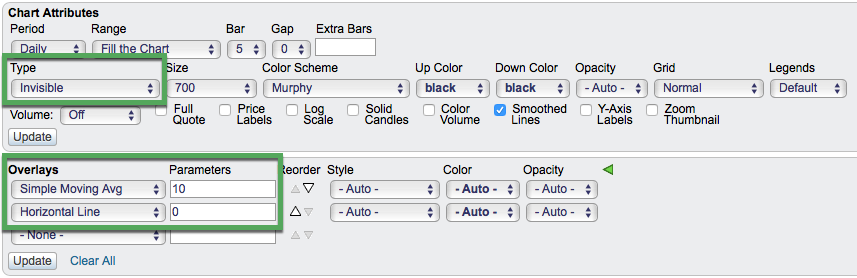
The raw data is already an oscillator, with values fluctuating above and below the zero line. The SMA line just smooths out the values and creating a less “noisy” oscillator. This makes it easier to see and act on signals like zero line crossovers.
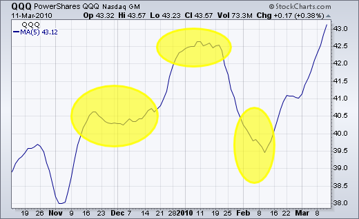
While Cumulative and Histogram chart types are used almost exclusively with market breadth indicators, Invisible is a chart type that can be useful for other ticker symbols, especially those showing a lot of volatility. This often happens during periods of consolidation. For example, the PowerShares Nasdaq ETF (QQQ) was very volatile during a few periods in 2009-2010. Chartists could benefit from making its price plot invisible and focusing on its moving averages instead.
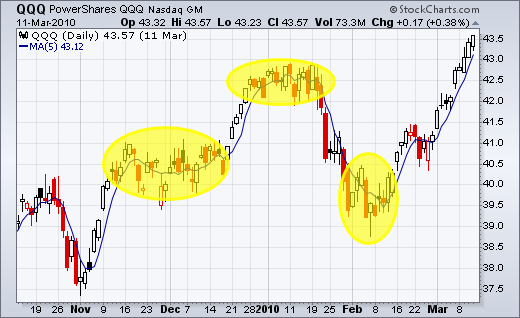
Without the daily candlesticks, it is easier to spot the trends during these volatile periods:
Conclusions
The Histogram, Cumulative, and Invisible chart types are valuable resources for your market breadth SharpCharts. Using these chart types can reduce the noise on many breadth indicator charts, making it easier to interpret the data. These chart types can be used on the main price plot or in indicator panels, wherever they are needed to smooth erratic breadth data.