Table of Contents
Displaying More Than One Stock On a Chart
Displaying more than one stock on a single SharpChart is a very powerful feature, allowing you to easily compare two or more stocks visually.
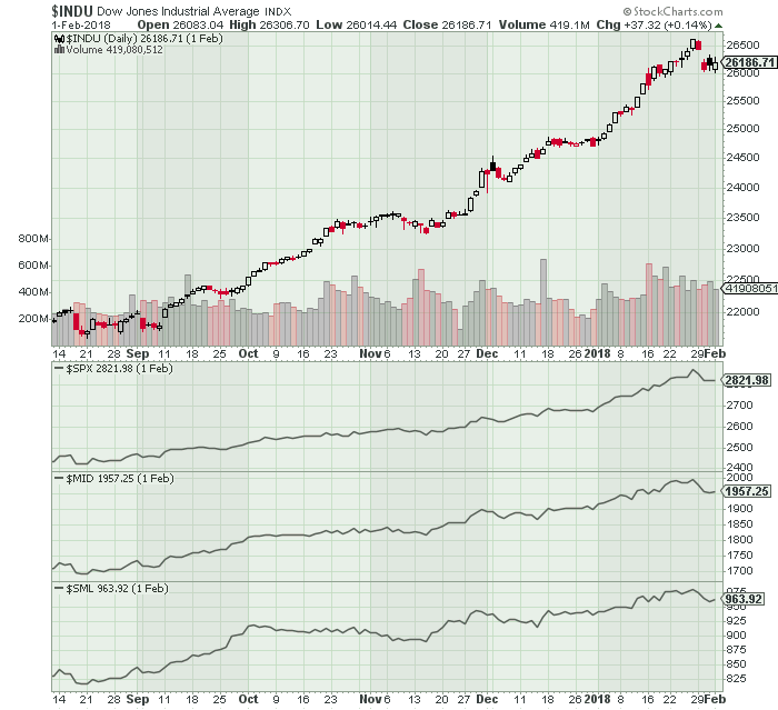
In this step-by-step tutorial, we'll create a chart of the Dow with the S&P Large Caps, Mid Caps, and Small Caps below it.
Create the SharpChart
Step 1:
The Dow ($INDU) will be the main symbol on our SharpChart. There are several ways to create a new SharpChart, but the easiest is to just enter the symbol in the Create-a-Chart box at the top of the page, then click “Go”.

Step 2:
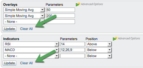
To make the chart simpler, let's remove any Indicators and Overlays on our default chart. The quickest way to do that is to click the “Clear All” link in the Overlays section, then repeat the process with the “Clear All” link in the Indicators section. Once that's done, click one of the “Update” buttons to update the chart.
Note: you may want to make other changes to the chart, such as changing the size or the color scheme. We're using the “Spruce” color scheme in this example.
Add Other Ticker Symbols to the Chart
You can use the “Price” indicator to add additional ticker symbols to your chart. In this example, we're going to add $SPX, $MID, and $SML to the chart.
Step 3:
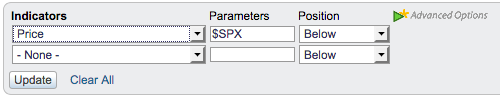
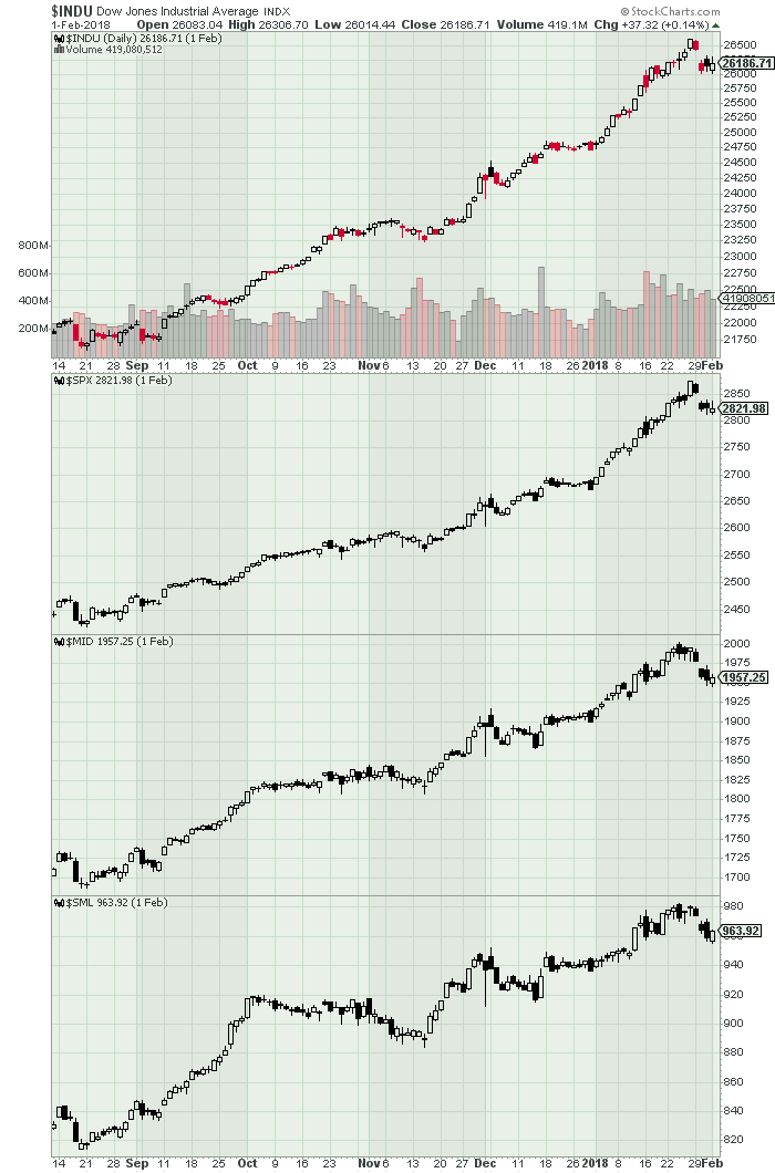
Select “Price” from one of the empty indicator dropdowns, and then enter the ticker symbol you want to chart in the “Parameters” box. In this case, we will use $SPX for the S&P 500. Make sure the Position dropdown is set to “Below”, so the $SPX chart will appear below the main chart. Finally, click on the of the “Update” buttons to update the chart.
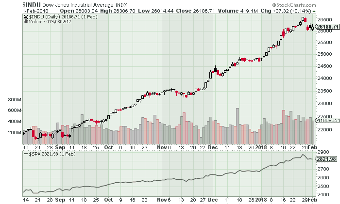
Once these changes have been made, your chart should look something like this:
Step 4:
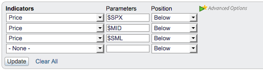
Repeat the previous step two more times to add the other two indexes. Don't forget to change the value in the Parameters boxes to $MID and $SML. When you're done, click the “Update” button to update the chart.
Now your chart should look something like this:
Changing the Style of the Price Indicators
By default, the Price Indicator displays a fairly compact line chart, but we can adjust the settings to something more suitable for our analysis needs. These settings are available for members only, in the Advanced Options area.
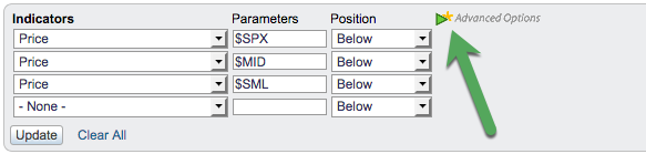
Step 5:
Members who are logged in should see the green “Advanced Options” triangle located just to the right in the Indicators area (note that this is different than the one in the Overlays area).
If the Advanced Options area isn't already visible on the SharpCharts Workbench for your Price Indicators, click the green triangle to make it appear.
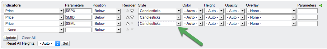
Step 6:
First, let's display the three Price Indicators as candlestick charts instead of line charts. Find the “Style” dropdown menu next to each of the three Price Indicators, and change them all from “- Auto -” to “Candlesticks”, then click the Update button to make these changes on your chart.
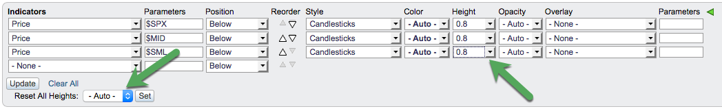
Step 7:
Now all four price plots are candlestick charts, but the three Price Indicator charts are still very short. Let's change the three Price Indicator charts to be 80% as tall as the Dow chart.
You can change the Height of each Price Indicator to 0.8 individually, but a quicker way to achieve this is to change the “Reset All Heights” value at the bottom of the Indicators section to 0.8, then click the “Set” button. This will automatically change the height of all the indicator panels to that height. Once the heights have been changed, click the “Update” button to see the results on your chart.
After making these style changes to the Price Indicators, your chart should look something like this:
Adding Time Scales
You may have noticed that while there are date/time labels along the bottom of the main price panel, and below the last indicator panel, there aren't any for the other two indicator panels. Fortunately, they are easy to add to our chart.
Step 8:
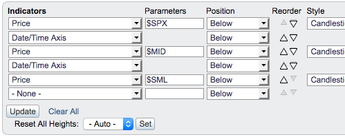
In the Indicators area, select “Date/Time Axis” in the empty indicator dropdown. In the new empty indicator dropdown that appears, repeat this process. Now you should have two “Date/Time Axis” indicators listed in the Indicators area.
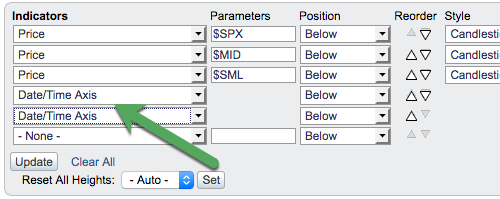
Step 9:
Since the indicators appear on the chart in the order they are listed, we need to move the two “Date/Time Axis” indicators: one directly below the $SPX Price Indicator, and one directly below the $MID Price Indicator. Click the “Reorder” arrows that are pointing upwards (outlined in green and yellow in the screenshot below), until those two “Date/Time Axis” indicators are situated directly below the $SPX and $MID indicators.

Once they have been moved in place, your Indicators area should look like this:
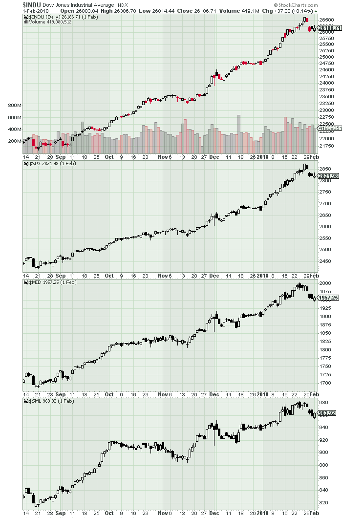
Click the “Update” button to update your chart with the latest settings.
The Final Product
Bonus Y-Axis Settings
In addition to the settings covered above, there are two ways you can customize the y-axis on a Price Indicator panel:
- Inverting the Chart - This setting can be useful for $VIX and other volatility-focused symbols. To invert the y-axis of the chart so that the high values are at the bottom and the low values at the top, simply add a comma and a second parameter “inverted” in the “Parameters” box for your Price Indicator.
- Using Log Scale - By default, the Price Indicator is plotted using arithmetic scale, but if your main chart uses log scale, you may want to use the same on your Price Indicator. To change the Price Indicator to use log scale, simply add a comma and a second parameter “log” in the “Parameters” box for your Price Indicator.
Note: these two y-axis settings can be used together in a single Price Indicator panel. For example, to plot an inverted log scale price indicator for $VIX, you would enter in the Parameters box: $VIX,inverted,log