Table of Contents
Editing StockChartsACP Charts
Configuring Your Charts
StockChartsACP charts are customizable, from the basics—chart type, period, and range—to adding complex combinations—overlays and indicators. This allows you to set up your StockChartsACP charts so they fit your trading style and technical analysis needs.
Chart settings can be changed from the Basic Chart Settings menu at the top of the screen and the Chart Design menu at the left.

Chart setting changes take effect immediately—you can instantly see the effect of any adjustments you make.
Note: If you're working on a chart that has been saved to a ChartList, your changes will not be automatically saved to the chart in your ChartList. Be sure to click the Save button above the chart to save those changes once you're finished editing.
A Note on Editing in Multi-Chart Layouts
If you're using a multi-chart layout, be sure to click on the chart you want to edit before changing any settings. The currently-selected chart will have a green border around the edge of the chart.
Learn More: StockChartsACP Layouts
Type, Period, and Range
From the Basic Chart Settings menu at the top of the screen, you can change the chart's type, period, and range.
- Chart Types: We currently offer twelve chart types, including candlesticks and OHLC bars; more will be offered in the future.
- Periods: Several intraday, daily, weekly, and monthly periods are available.
- Range: The Range setting controls the amount of data that is visible on the chart (similar to the range options available on SharpCharts).
The period and range are tied together. If you choose a different period for your chart, then a “suitable” range will be chosen for the chart that is displayed, and vice versa. Once you've chosen the period you want, you can zoom in or out to adjust the range to meet your needs.
While the Range options available in the dropdown menu are similar to SharpCharts, the range in ACP is more of an initial configuration than a persistent setting. With SharpCharts, the size of the chart remains fairly fixed, but with ACP it is easy to change the chart's size by zooming, scrolling, or resizing the browser window. This resizing of the ACP chart will affect the number of bars (and therefore the range) that is displayed on the chart.
Note: Just like with SharpCharts, free users have access to fewer Range and Period options than StockCharts members have.
Adding Chart Attributes
The Chart Settings icon in the Chart Design menu on the left gives you access to a wealth of other chart settings. In the panel that slides out, click on the symbol name or gear icon at the top. From here you can change the chart scale, color scheme, legend, price and event labels, and much more. For quick access to these settings, you can also click on the symbol name in the chart's legend.

The following settings can be changed on the Chart Attributes panel:
- Y-Axis Scale. Choose between arithmetic and log scale for your chart. For more information on the difference between arithmetic and log scale, please see our ChartSchool article on price scaling.
- Chart Header. Choose between a Slim, Standard, or Full Quote header for your chart. For narrower charts, a Slim chart header will be displayed regardless of the setting chosen here.
- Extra Bars (pixels). This slider allows you to add extra space to the right of the most recent bar on your chart.
- Top Margin (pixels). This slider allows you to add or reduce the space at the top of your chart.
- Bottom Margin (pixels). This slider allows you to add or reduce the space at the bottom of your chart.
- Chart Color Scheme. The dropdown menu displays all the different color schemes you can select for your chart. More on color schemes below.
- Grid Style: Choose between a Normal or Dense grid on the background of your chart, or turn the grid off entirely.
- Legends: Choose between displaying Verbose, Default, or Minimal information in the chart's legend, or turn the legend Off entirely.
- Date/Time Axis: Choose to have the date/time axis displayed either at the bottom of the chart (the default) or directly below the main price plot area.
- Other Settings: In this section, you can specify whether to show or hide various elements on your chart:
- Extended Hours: include extended hours (pre- and post-market) bars on the chart if they are available. Learn more about our Extended Hours Data in the Support Center.
- Last Price Reference Line: draws a dashed line across the chart at the level of the latest price.
- Price Labels: show price labels at significant points on the chart.
- Y-Axis Labels: shows the current price on the Y-Axis at the right edge of the chart.
- Hide Left Y-Axis: if the chart has an optional secondary Y-axis on the left side of the chart, it is shown by default; checking his box will hide that y-axis on the left. This setting can be useful if space is at a premium.
- Fit Overlays to Screen: this setting ensures that all parts of the overlay are visible on the screen, and is useful for overlays like Bollinger Bands, which frequently extend well above or below the price bars; when unchecked, parts of the overlay may extend beyond the upper or lower edge of the chart.
- Chart Type-Specific Settings: The options available in this section will depend on the type of chart you're modifying. For example, if you are configuring a candlestick chart, you can specify in this section whether the candles are hollow or filled, the colors to use for up and down candles, and the size of the gap between candles.
- Events: Check these boxes to display Earnings Dates, Dividends, Splits, and/or Predefined Alerts on the chart. The “Position” dropdown menu in this section allows you to position those event markers at the top or the bottom of the chart, slightly above the price bars, or directly on the price bars.
- Alerts: Check the “Display Price Alerts” checkbox to display a horizontal line indicator wherever you have a price alert set for the chart's symbol. You can also configure the color and style of this horizontal line.
Changes made on the Chart Attributes panel take effect immediately. You don't need to save the settings and refresh the chart to see the effect of your changes.
Candlestick Coloring
In StockChartsACP, you can customize your candlesticks with different body, wick, and outline colors for up and down price movements. By default, the wick and outline colors will match the body colors and remain in sync until a custom color is selected, after which they will be controlled independently. To re-sync the wick and outline colors with the candlestick's body, click the Reset button within the color picker.
Using Color Schemes
There are tons of stylish color schemes you can apply to your StockChartsACP charts. The style collections are divided into three broad categories—dark, light, and specialty color schemes.
From the Chart Color Scheme dropdown menu, select any color scheme you want to use on your chart.

In the example above, the chosen color scheme is Carmine. The default StockChartsACP color scheme is Murphy.
Indicators and Overlays
As a StockCharts member, you can add up to 25 indicators and 25 overlays to each StockChartsACP chart.
Technical Indicators can be added to your chart on indicator panels above or below the main price plot area of the chart. Some examples of commonly used technical indicators include MACD, RSI, and Stochastics.
Technical Overlays are calculated using the same vertical scale as the price bars, so they are typically displayed on top of the main symbol's price bars. Examples of overlays include moving average lines, Bollinger Bands, and Pivot Point lines.
Note: Just like with SharpCharts, free users are limited to a maximum of 3 indicators and 3 overlays per chart.
The Chart Outline
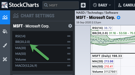
Click on the Chart Settings icon in the Chart Design menu on the left. This opens a panel that shows the indicators and overlays currently in use on your chart. Indicators listed at the top are displayed above the main price plot, and indicators listed at the bottom are displayed below the price plot. Overlays on the main price plot are listed between the two dividers.
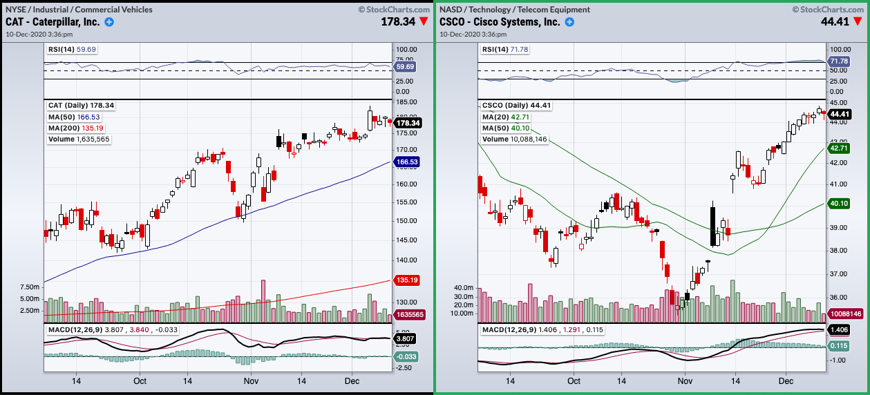
In the example below is a chart of Micron Technology, Inc. (MU) with an RSI panel displayed above the main price plot, two moving averages and volume overlaid on the main price plot, and a MACD indicator displayed below the main price plot.

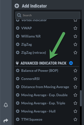
Adding Indicators and Overlays to a Chart
In Chart Settings, below the Chart Outline, you'll find a searchable list of available indicators and overlays. To add a new indicator or overlay to your chart, scroll down the list, and when you find the indicator you're looking for, click on it to add to your chart.

By default, indicators are added below the main price plot area and overlays are overlaid on the main price plot area. Both indicators and overlays can be repositioned after they are added to the chart.
When the indicator or overlay is added, a panel will open where you can change its settings.
Indicator Plug-Ins
In addition to the many built-in indicators and overlays available for StockChartsACP, you can add even more indicators and overlays through the use of plug-ins. There are many free and paid plug-ins available for StockChartsACP, which install additional indicators and overlays to your StockCharts account for use on your StockChartsACP charts.
Once installed, these add-on indicators will be available at the bottom of the indicator selection list in the Chart Settings panel.
Learn More: StockChartsACP Plug-Ins
Changing Indicator Settings
Available settings vary from one indicator/overlay to the next, but typically you will be able to specify the color of the various indicator components, as well as settings like the number of periods that will affect the sensitivity of the indicator.
There are a number of ways to access the settings for an indicator:
- Mouse over the indicator on the Chart Settings panel and click the gears icon next to the indicator.
- Click on the indicator name in the legend of the chart.
- And of course, when you add a new indicator or overlay to your chart, the settings menu will be launched for that indicator automatically.
The panel that opens allows you to change all the settings for the indicator. Changes to the settings take effect immediately. For example, you can use the slider bar to change the number of periods in an RSI and watch the chart adjust as the slider moves.
To revert to the default settings for the indicator, click the blue Reset button at the bottom of the panel.
To delete the indicator from your chart, click the red trash can icon at the bottom of the panel.
Click the “X” icon at the top right of the panel or they grey Close button at the bottom to close the panel.
Note: For some indicators, there will also be an orange Info button next to the Reset and Delete buttons at the bottom of the panel. Clicking this Info button will take you to a ChartSchool page where you can learn more about that indicator.
Color Picker
The color picker allows you to set both the color and opacity of various components of the indicator. Click on the paint icon next to the component you want to change. This will launch the color picker:
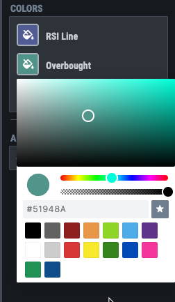
The large circle on the left shows the currently-selected color. The color code for the current color is shown in the box below the large circle.
There are three different ways to change the color of a chart component:
- To choose a standard color, you can click on one of the standard color boxes at the bottom of the picker.
- To choose a non-standard color, scroll back and forth on the rainbow slider bar to find the general color family you want to use. Fine-tune by clicking in the panel at the top of the color picker.
- You can type the color code for the desired color in the box below the large circle. If you want to exactly match the color of another chart component, you can copy the color code from one chart component, then paste it in the color code box of the chart component you want to update.
To change the opacity of the component, use the second slider bar. Sliding to the left makes the component more transparent and sliding to the right makes it more opaque.
To save a color/opacity combination for future use, click the Star icon on the right. This will save the current color/opacity combination at the bottom of the color picker (green and blue color/opacity combos have been saved in the example above). Up to 7 color/opacity combos can be saved. To use the color/opacity combo later, simply click on the box at the bottom of the color picker to select it.
Once you've set the color and opacity, click on the panel outside of the color picker to close it.
Positioning Indicators and Overlays
Indicator panels can be moved above or below the chart or even added to the main price plot or another indicator panel as an overlay.
To move an indicator/overlay, click and drag on the indicator/overlay name in the legend. As you drag, the indicator will separate from the chart.

As you drag the panel around the chart, a bright yellow line will show you where the indicator will be positioned when you let go of the mouse. If the yellow line is a horizontal line above the price plot, the panel will be positioned above the price plot. If it's a horizontal line below the lower indicator panel, the panel you're moving will be positioned below the lower indicator panel.
If the yellow line forms a box around one of the panels (either the main price plot or one of the indicator panels), then the indicator/overlay you're moving will be added to that panel as an overlay.
Indicators and overlays can be repositioned from the Chart Outline in much the same way. Simply click the “equals sign” icon next to the indicator name in the outline and drag the indicator to the desired position in the outline. The yellow line will show where the indicator/overlay you're moving will be placed. If an entire panel is highlighted yellow, then the indicator/overlay will be added to that panel as an overlay.

In addition to moving panels, you can change the order of the overlays listed in the legend. To do this, mouse over the overlay in the Chart Outline, then click the up/down arrows next to an overlay to move it.

Resizing Indicator Panels
To change the height of an indicator panel, place your mouse between the panel and the one above or below it. When your cursor changes to an up/down arrow, click and drag up or down to change the height of the panels.
Removing Indicators and Overlays
There are two ways to remove indicators and overlays from a chart.
1. On the settings panel for the indicator, click the red trash can icon.

2. In the Chart Outline on the main Chart Settings panel, mouse over the indicator/overlay you want to delete and click the trash can icon.

Be aware that both methods will delete the indicator/overlay immediately; it will not ask you to confirm that you want to delete it. Use this feature with caution.
Creating Overlays of Indicators
Overlays are typically calculated from price data and displayed on top of the main symbol's price bars. Overlays (and some indicators) can also be calculated from the data of another indicator and displayed on top of that indicator panel.
To add an overlay of an indicator, open the indicator settings panel. In the Add Overlays section of the panel, choose the desired overlay to add. In the example below, we have chosen to add Bollinger Bands to our RSI indicator panel.

Click the gears icon next to the overlay to modify the default settings for the overlay.
Once the overlay has been added, it appears in the Chart Outline in the same section as the indicator it overlays. In the example below, our Bollinger Bands overlay now appears in the RSI section of the Chart Outline, and we can see that a Bollinger Bands overlay has been added to the RSI.
The process above is the quickest and easiest for adding overlays to indicators, but in some situations, you may want or need to add the overlay manually using the following two-step process.
First, add the overlay and reposition it on the indicator panel, so it will be displayed on top of the indicator panel values.
Second, edit the overlay by clicking on its name in the legend. You will see a Calculated From field in the settings for the overlay. By default, this is set to Close, but you can change this setting to calculate using the values of the underlying indicator panel:

Using Chart Templates
While the extensive chart settings of StockChartsACP give you a lot of control over your charts' appearance and functionality, configuring all those settings can take a long time.
If you find yourself configuring the same chart settings repeatedly, Chart Templates can dramatically speed up your chart creation process. Save all those settings in a Chart Template, then apply the style to new charts with the click of a button.
Learn More: StockChartsACP Chart Templates