Table of Contents
P&F Charts
Point and Figure Charts are charts that contain columns of X's and O's on a grid of square boxes. Columns of X's alternate with columns of O's. The X's represent a period of rising prices while the O's represent a period of falling prices.
For details on how P&F Charts are constructed and how they are interpreted, please see our ChartSchool article on P&F Charting.
Here is an example of a Point and Figure chart:
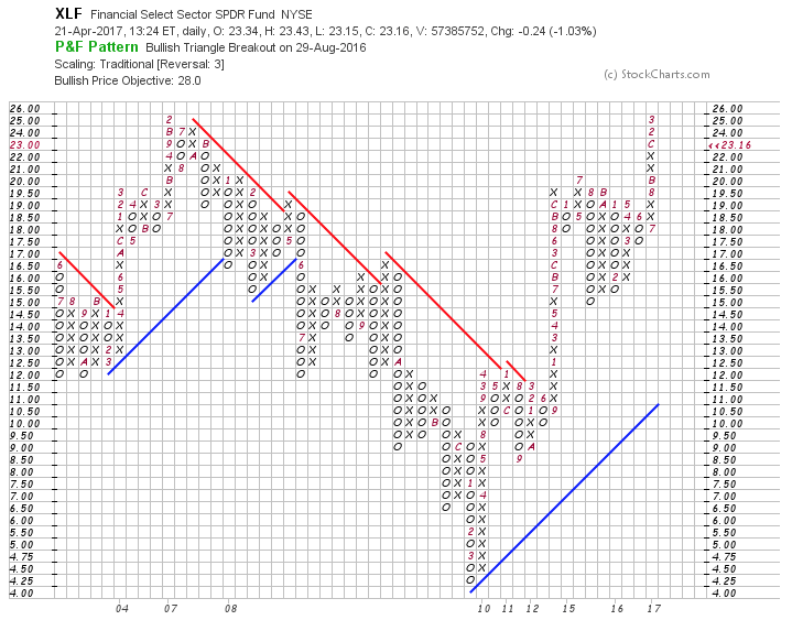
In addition to the basic price quote at the top of the chart, this header area also lists any new P&F Patterns that appear on the chart. For more information on the P&F chart patterns that we automatically detect on our P&F charts, please see our ChartSchool article on P&F Pattern Alerts.
The current Price Objective can also be shown in the header area at the top of the chart. P&F Price Objectives are often misunderstood and misused. We recommend you learn more about how P&F Price Objectives are calculated and used correctly by studying our ChartSchool article on Price Objectives.
Creating P&F Charts
Just like SharpCharts are created and customized in the SharpCharts Workbench, P&F Charts are created and customized in the P&F Workbench.
P&F Charts can be created for any ticker symbol in our database. There are a number of ways to do this:
- Using the “Create a Chart” bar at the top of any of our web pages. First, change the dropdown from “SharpChart” to “P&F Chart,” then enter the ticker symbol you wish to chart and press the “Go” button.
- Clicking on the “Point & Figure Chart” link at the bottom of the SharpCharts Workbench.
- Clicking on the “P&F” icon which is located on most of our report pages (Market Summary, Sector Summary, etc.) and our Scan Results pages.
- Clicking on “Charts & Tools” at the top of any page, then entering a ticker symbol into the “Point & Figure Charts” section of that page.
- Clicking on the “Point & Figure” link in the “Member Tools” area of Your Dashboard.
Using the P&F Workbench
Once the chart has been loaded in the P&F Workbench, you can change the settings for the chart just as you would on the SharpCharts Workbench, using the controls above and below the chart.
After making any changes to the settings, be sure to press “Update” (or the Enter key) to see the new chart.
Above the Chart

Above the P&F Chart, you will find controls for setting the ticker symbol and the data bar period. If you are a StockCharts member, you will also see controls for saving your chart in a ChartList, as well as for retrieving previously saved charts. All of these controls work just as they do on the SharpCharts Workbench.
Action Links

Immediately below the chart is a line of “Action Links” which allow you to perform a variety of actions:
- Print - creates a printable version of the P&F Chart
- Share - lets you share your P&F Chart in a variety of ways, including email and social media sites
- Permalink - creates a link to the chart that you can then bookmark, send to friends, etc.
- Past Data - allows members to see the underlying data that was used to create the chart
- Instructions - takes you to this page for more info on using P&F Charts
- Report Problems - allows you to send a problem report to the StockCharts Support team
ChartStyles Area

ChartStyles are templates - collections of settings - for charts. Once you have a ChartStyle, you can apply it to any ticker symbol to create a chart that uses those settings.
Currently, the P&F Workbench does not support StyleButtons like the SharpCharts Workbench does. The P&F Workbench has predefined ChartStyles and you can create your own custom default ChartStyle as well.
Predefined ChartStyles
Our predefined P&F ChartStyles can be accessed via the ChartStyles dropdown. Just select the style you want and it will immediately be applied to the current chart.
Default P&F ChartStyle
Whenever a new chart is created from just a ticker symbol - for example, when you use the “Create a Chart” bar to create a new P&F Chart - we apply the “Default” P&F settings to that ticker symbol. You can change those settings if you want by clicking on the “Save As Default” link.
Note: Your Default P&F settings are stored in a special “cookie” inside your web browser.
Applying Styles to ChartLists
To apply a P&F ChartStyle to all the other charts in a ChartList, you must first display one of the charts in the ChartList. Set it to the ChartStyle you want, using the instructions above. Then, click the “Apply Style To All” button at the bottom of the P&F Workbench. This will change all the other charts in the ChartList to match the one you are currently displaying.
Chart Attributes
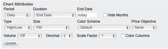
Below the chart, you can change several Chart Attributes, those being the settings that affect the entire chart. These include:
- Period - the period of the bars used in creating the P&F Chart.
- Duration - the date that the chart ends on. Set “End Date” value to “today” to have the chart continually update. If an end date is specified, the chart will not update with new data beyond the selected date.
- Hide Months - hides or displays the red letters and numbers on the chart signifying the first box of each month.
- Type - either “High/Low” or “Close Only.”
- Size - the width of the chart (in pixels).
- Color Scheme - the colors used to draw the chart.
- Price Objective - enables the display of Price Objectives on the chart.
- Volume - enables a volume histogram at the bottom of the chart.
- Decimal - controls the number of decimal points on the vertical axis.
- Scale Factor - multiplies price data by the selected amount before creating the chart.
- Color Columns - colors up columns black and down columns red.
Note: P&F Price Objectives (also called “P&F Counts”) can be enabled using the “Price Objective” dropdown. Please note that Price Objectives are often misunderstood. Please read our ChartSchool article on Price Objectives carefully before evaluating them.
Chart Scaling
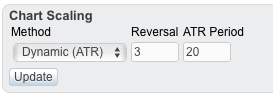
The Chart Scaling section allows you to change the conditions which cause reversals on the P&F chart. (Please see our ChartSchool article on P&F Scaling and Timeframes for details on choosing these settings.)
The Method dropdown allows you to select the scaling method you want to use. Depending on the scaling method selected, one or more parameter boxes will appear to the right of the dropdown.
Here are scaling methods we support:
- Traditional scaling uses a predefined table of price ranges to determine what the box size should be. The table was originally created by the people at ChartCraft and later popularized by Tom Dorsey in his book Point & Figure Charting.
| Price Range | Box Size |
| Under 0.25 | 0.0625 |
| 0.25 to 1.00 | 0.125 |
| 1.00 to 5.00 | 0.25 |
| 5.00 to 20.00 | 0.50 |
| 20.00 to 100 | 1.00 |
| 100 to 200 | 2.00 |
| 200 to 500 | 4.00 |
| 500 to 1,000 | 5.00 |
| 1,000 to 25,000 | 50.00 |
| 25,000 and up | 500.00 |
- Percentage scaling (also called logarithmic scaling) uses box sizes that are a fixed percentage of the stock's price. For example, if a chart used 5% scaling and the stock's price is $100, the box size for that part of the chart would be $5.00. Enter the desired percentage used for scaling in the Box Percent field. The default is 1.0 for 1%.
- Dynamic (ATR) scaling uses a box size determined by the daily Average True Range value for the chart. This setting automatically creates an interesting-looking chart; however, because it is based on volatility, this setting can cause the chart to change significantly from one day to the next. Enter the number of periods to use for calculating the ATR in the ATR Period Field. The default value is 20 periods.
- User-defined scaling uses a fixed box size set by the user. Enter the desired box size in the Box Size field. The default is 1.0.
Regardless of the method chosen, the Reversal field is where you enter the number of boxes that a stock needs to move in the opposite direction to warrant a column reversal. The default value is 3 boxes.
Chart Overlays
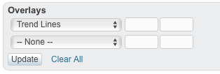
There are several technical overlays that you can add to a Point & Figure chart using the dropdowns and parameter boxes in this section. You can add up to 6 overlays to a chart.
- Trend Lines automatically add 45-degree trend lines to the chart. They alternate between bullish (blue) and bearish (red) lines. A P&F trend line is in effect until it is violated.
- Simple Moving Average is calculated based on the midpoint of each column of X's and O's. Enter the number of periods to be used for the moving average calculation in the first parameter box. The default value is 20.
- Bollinger Bands are calculated based on the midpoint of each column of X's and O's. Enter the number of periods to be used in the calculation in the first parameter box. Enter the standard deviation in the second parameter box. The default values are 20 and 2, respectively.
- Volume by Price shows a horizontal histogram with each bar representing the cumulative volume for that price level.
- Price Plot includes a small version of the OHLC bar chart for the ticker symbol in the background of the P&F chart.
- Reversal Marker shows the location of the next reversal for the chart based on its current reversal settings.
Note: The indicators are based on the X and O levels on the Point & Figure chart. In other words, they are based on P&F prices, not on the daily price/volume of the actual security. Do not expect indicators on the P&F charts to look the same as indicators on a daily bar chart.
Frequently Asked Questions
Q: What do the numbers and letters on P&F charts represent?
A: Numbers and letters on the chart indicate when a new month has begun. For instance, the number “2” shows where February started. The letters “A,” “B” and “C” are used to indicate the beginning of October, November and December.
Q: Can I annotate a P&F chart?
A: P&F charts cannot be annotated.
Q: Why did I not see a reversal today?
A: When the current column is an X-Column (rising), another X can be drawn and ignore the low.