Table of Contents
Your Dashboard
Your Dashboard is the first page that you see when you log in to your StockCharts.com account. You can also access it at any time by clicking on the “Your Dashboard” link at the top of any of our pages.
Your Dashboard is designed to:
- provide easy access to all of our most important tools and features
- provide a brief overview of the current market action
- allow you to quickly access your saved scans and custom alerts
- allow you to quickly access your saved ChartLists
To accomplish these goals, Your Dashboard is broken up into several different panels, which are described in the following sections.
Member Tools
The top-left panel on the dashboard is the Member Tools section. This panel provides you with quick links to many of our top tools and features. Whether you want to see your custom alerts, create an RRG chart or dig into the Sector Summary, you'll find a link to it here.
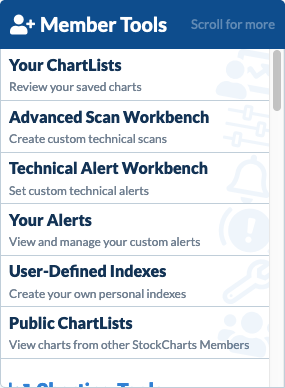
Note: We've packed so much good stuff in here that it can't fit on one screen, so be sure to hover over the list and scroll down to see all the tools available.
Market Overview
The Market Overview panel provides a quick snapshot of what is currently happening with the major stock markets that we cover, as well as whether the US markets are currently open or closed. The mini-chart shows you the intraday price action for two full trading days. A dashed line on the chart shows you where yesterday's closing value occurred, allowing you to compare it to today's trading action.
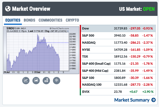
Initially, the chart shows you the action for the Dow Jones Industrial Average, but you can click on any of the indexes listed in the table next to the chart, to see the chart for that index. Use the tabs above the chart to change the display between equity indexes and other types of securities, including bonds, commodities, and cryptocurrencies.
The table next to the chart shows you gain/loss for each of the indexes and securities listed. When the market is open, the gain/loss is for the current day's price action. When the market is closed, it is for the price action on the most recent trading day.
The blue Market Summary link at the bottom of the panel will take you to our extensive Market Summary report, which provides more details on the day's market action.
Data Panels
You can have up to four Data Panels on your dashboard, which show reports of stocks that are making a move in their respective markets, as well as important technical signals covering entire markets. These reports are updated frequently when the markets are open.
One of these Data Panels is visible by default. You can add three additional Data Panels to your dashboard by clicking on the “gears” icon at the top right of the dashboard screen and making sure the “Additional Data Panels” option is selected.
The “More” button at the top right of each Data Panel allows you to choose from a number of different reports, as described in the subsections below.
Sector Summary
The Sector Summary shows you the performance of all eleven US sectors at a glance. Clicking on any of the sectors will display a SharpChart for that Sector SPDR. Links above the chart allow you to launch a CandleGlance, PerfChart, or RRG Chart showing all the sector SPDRs.
The blue Sector Summary link at the bottom of the panel will take you to our popular Sector Summary, where you can drill down to find the best-performing stock in the best-performing industry in the best-performing sector, all with just a few clicks.
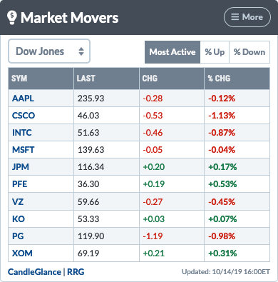
Market Movers: Top 10 Lists
The Market Movers report shows stocks that are making a strong price move today. Use the dropdown menu at the top left of the panel to choose the universe represented; we currently offer the Dow, S&P 500, NYSE, NASDAQ, TSX, London (LSE) and India (NSE).
Once you have chosen your universe, the tabs above the report allow you to view the top stocks based on different criteria. The 10 most active stocks (“Most Active”) are shown by default, but you can also see the stocks with the biggest percentage gain or loss (“% Up” or “% Down”). Clicking on any of the ticker symbols in the report causes a SharpChart for that ticker symbol to appear.
Below the report are two links - one for “CandleGlance” and one for “RRG.” Clicking on the CandleGlance link will bring up 10 mini-charts for the 10 symbols displayed. Similarly, clicking on the RRG link will bring up an RRG chart for the 10 symbols displayed.
Note: The “Most Active” tab only displays symbols with a closing value of 1.00 or higher. The “% Up” and “% Down” tabs only display symbols with a closing value of 5.00 or higher.
SCTR Reports
The SCTRs report shows securities with the strongest SCTR rankings. Use the dropdown menu at the top left of the panel to choose the universe represented. We currently offer US ETFs and US Large-Cap, US Mid-Cap, US Small-Cap, Toronto, London (LSE) and India (NSE) stocks.
Once you have chosen your universe, the tabs above the report allow you to view the top securities based on different criteria. Securities with the highest SCTR values (“Top 10”) are shown by default, but you can also see those with the lowest SCTR values (“Low 10”) or those that had the biggest gain or loss in SCTR value (“Top Up” or “Top Down”). Clicking on any of the ticker symbols in the report causes a SharpChart for that ticker symbol to appear.
Below the report are two links - one for “CandleGlance” and one for “RRG.” Clicking on the CandleGlance link will bring up 10 mini-charts for the 10 symbols displayed. Similarly, clicking on the RRG link will bring up an RRG chart for the 10 symbols displayed.
Ticker Cloud
The Ticker Cloud report displays the ticker symbols that are currently popular with our members. The larger the symbol name, the more popular the ticker symbol is. Clicking on any of the ticker symbols in the report causes a SharpChart for that ticker symbol to appear. Click the “Popular Symbols” link at the bottom of the panel to see the full Ticker Cloud.
Predefined Alerts
The Predefined Alerts report shows the 10 most recent major market signals from our Predefined Alerts page. Clicking on an alert causes a SharpChart for the relevant index or indicator to appear. Click the View All link at the top left to see all our Predefined Alerts.
DP Scoreboard Signals
The DP Signals report summarizes DecisionPoint signals for key US indexes. Use the dropdown menu at the top left of the panel to choose the index. We currently offer DP Signals for the Dow, S&P 500, NASDAQ 100, and S&P 100.
Market Factors
The Market Factors report displays a grid that shows how large, mid, and small-cap value, core, and growth exchange-traded funds (ETFs) are performing. The grids are color-coded, with green representing an upward move and red representing a downside move.
For example, if you’re interested in the performance of large-cap core stocks, click on the corresponding grid. You’ll see a SPDR S&P 500 ETF (SPY) chart, which you can analyze further.
Keller Market Model
The Keller Market Model report gives you a quick view of the overall market. You can choose to view the Market or Stocks model. Selecting the Macro Model gives you an idea of how stocks, bonds, commodities, and the US dollar could perform in the short, medium, and long term. The Stocks Model shows you how large caps, mid caps, small caps, and technology stocks could perform in the short, medium, and long term. Note that ETFs are used as a proxy to represent the various asset classes.
Chaikin Power Gauge
The Chaikin Power Gauge report lets you see an overall rating, financial metrics, earnings performance, price/volume activity, and expert activity for any stock. Type in the stock ticker symbol to view the ratings for the specific stock. You’ll also see a ratings overview which summarizes all the ratings for the stock you selected.
ChartList Panels
You can have up to two ChartList Panels on your dashboard, showing mini summary views of your selected ChartLists.
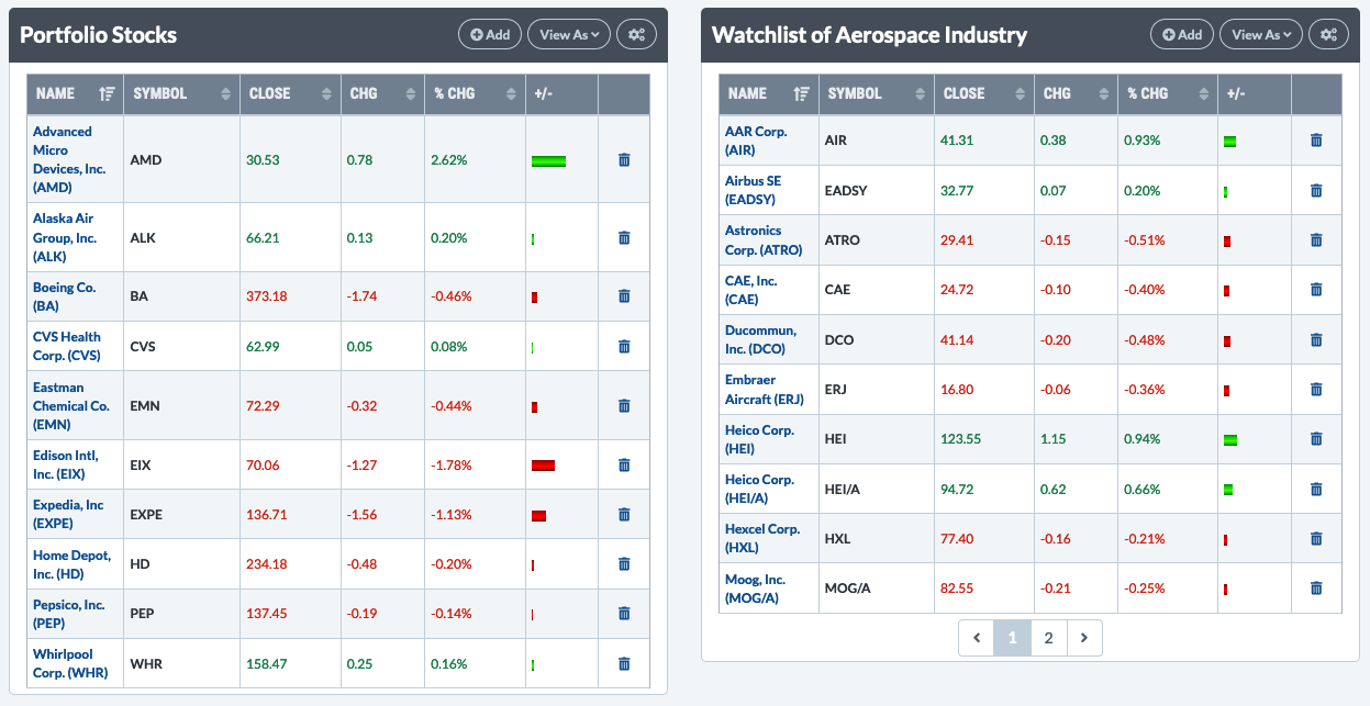
No ChartList Panels are visible by default. You can add two ChartList Panels to your dashboard by clicking on the “gears” icon at the top right of the dashboard and making sure the “ChartList Panels” option is selected. There is also a gears icon at the top right of each ChartList panel, which allows you to choose which of your ChartLists should be shown in that panel.
The mini summary table in the panel shows the name, symbol, closing value and price change information for the symbols in your ChartList. Clicking on any of the column headers will allow you to sort the ChartList by that column. Hovering over a symbol will display a mini-chart for that symbol, while clicking on a name will launch a full chart for that symbol.
If there are more than 10 symbols on your ChartList, buttons below the table will allow you to move forward and backward through the ChartList. Use the “View As” dropdown menu at the top of the panel to view the ChartList in other formats, such as 10 Per Page or CandleGlance.
Click the “Add” button at the top of the panel to quickly add a new symbol to that ChartList.
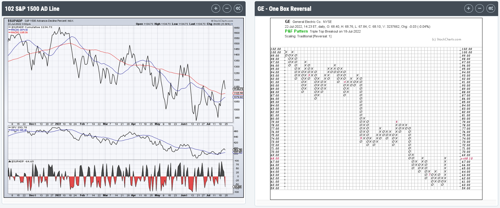
Chart Panels
You can have up to three different charts displayed on your dashboard. These can be saved SharpCharts from your ChartLists or ad-hoc charts you create by specifying a ticker symbol and a ChartStyle.
No chart panels are visible on your dashboard by default. You can add up to three panels by clicking on the “gears” icon at the top right of the dashboard, and making sure the “Chart Panels” option is selected.
If you have not added a chart panel before, you will see the chart panel configuration options for your first panel. You can access these options for an existing chart panel by clicking the gears icon at the top of the panel. To display a saved chart, click the Saved Chart tab, then select the desired ChartList and saved chart. To display an ad-hoc chart, click the New Chart tab, then enter a ticker symbol and select the desired ChartStyle. Once the chart is configured, click the Update Chart button to create the chart.
Additional chart panels (up to a maximum of three) can be added by clicking the plus button; a chart panel can be removed from the dashboard by clicking the minus button at the top of that panel. To access chart panel configuration options and change the chart displayed in the chart panel on the dashboard, click the gears icon at the top of that panel. To edit the chart itself, click on the chart to open it in the SharpCharts Workbench.
Your Scans
The Your Scans panel, shown below, allows you to quickly manage all your scans.
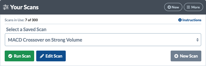
Clicking the “New” button in the top right of the panel will take you to the Advanced Scan Workbench to create a new scan. Click the “More” button at the top of the panel for quick access to all of our scanning tools, including the Advanced Scan Workbench, Standard Scan Workbench, and Predefined Scans page.
The “Select a Saved Scan” dropdown menu lets you easily select one of your saved scans. You can run or edit the scan by choosing the appropriate button below the dropdown.
For more information on creating and using scans, please see our Support Center article on Technical Scans.
Note: You can hide the Your Scans and Your Alerts panels on your dashboard by clicking the “gears” icon at the top right of the dashboard and making sure the “Scans & Alerts” option is deselected.
Your Alerts
The Your Alerts panel shows you your top 5 custom alerts at a glance, as well as the last time the alert was triggered. If you have more than 5 alerts, buttons below the table will allow you to move forward and backward through your list of alerts. Click the “View All” button at the top of the panel to go to the Alert Summary and see all your alerts on a single page.
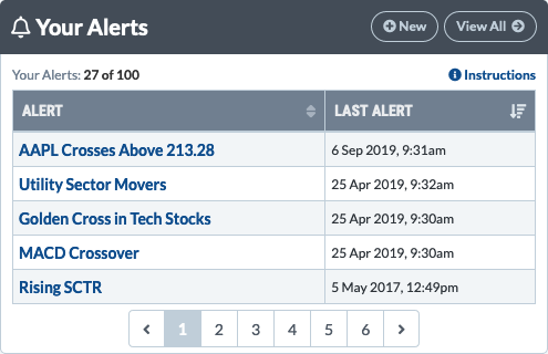
Clicking on the name of an alert in the list opens that alert in the Technical Alert Workbench so you can edit it. To create a new Alert, just click the “New” button at the top of the panel.
For more information on creating and using alerts, please see our Support Center article on Technical Alerts.
Note: You can hide the Your Scans and Your Alerts panels on your dashboard by clicking the “gears” icon at the top right of the dashboard, and making sure the “Scans & Alerts” option is deselected.
Commentary Panels
You can add two Commentary Panels to your dashboard by clicking on the “gears” icon at the top right of the dashboard and making sure the “Commentary” option is selected.
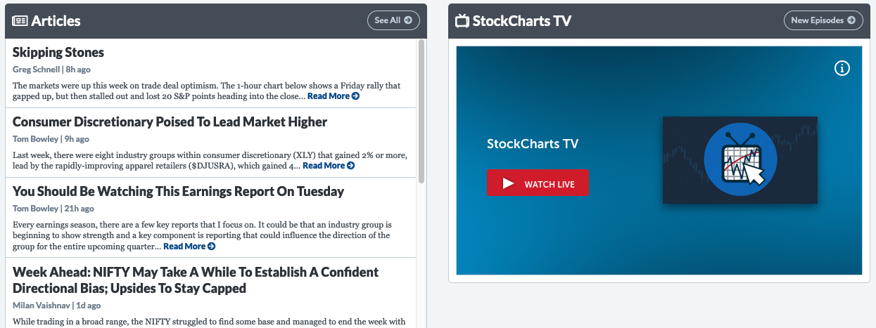
The commentary panel on the left showcases our 10 most recent blog articles. Click on the article title or Read More link to view the full article. The See All button at the top of the panel takes you to our articles page for access to all our written commentary.
The commentary panel on the right showcases our 24/7 streaming video channel, StockCharts TV. Click the Watch Live button to watch StockCharts TV right from your dashboard. The New Episodes button at the top of the panel gives you access to the latest episodes from each of our exclusive shows.
Your ChartLists
The Your ChartLists panel, located at the bottom of Your Dashboard, lets you view, access and manage all your saved ChartLists from one place.
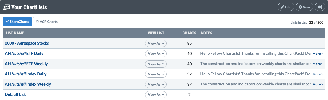
Use the “SharpCharts” and “ACP Charts” buttons at the top of this panel to switch between viewing SharpCharts lists and ACP lists.
Viewing SharpCharts ChartLists
When you click the “SharpCharts” button, your saved SharpCharts lists are shown here in alphabetical order, along with the number of charts and any list notes that have been added.
The “View As” dropdown next to each list allows you to open the ChartList in a number of different views, including 10 Per Page, CandleGlance and ChartBook view.
Clicking on the ChartList's name will show you the ChartList in Summary view by default. This default setting can be changed by clicking the Gears icon at the top right of the panel and selecting a new Default ChartList view.
Viewing ACP ChartLists
When you click the “ACP Lists” button, your saved ACP ChartLists are shown here in alphabetical order, along with the number of charts and any list notes that have been added.
Click on the ACP ChartList's name to view the list within StockChartsACP.
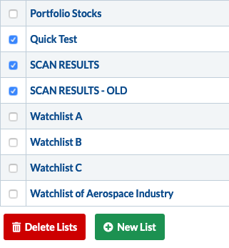
Deleting ChartLists
To delete one or more ChartLists, click the “Edit” button at the top right, then check the box to the left of each ChartList you want to delete. Once you have selected all the lists to delete, click the Delete Lists button at the bottom of the page. Use caution, as this process will delete the ChartList and all the saved charts on that ChartList.
Creating New ChartLists
You can create a new ChartList from this panel by choosing the “SharpCharts” or “ACP Charts” button, then clicking the “New” button at the top right or the “New List” button at the bottom of the page. To add pre-created SharpCharts ChartLists to your account, click the “Manage ChartPacks” button at the bottom of the page.
Learn More: SharpCharts ChartLists | ACP ChartLists
Next Up » SharpCharts